


We’ve all had to sit through bad presentations, the boring ones that go on too long, the complicated, badly planned presentations, or horror, the presentations with photos of the presenter’s child or cat.
While you may know the basic rules – keep text to a minimum, use contrasting colors, follow the 10-20-30 rule (10 slides, 20 minutes, 30 point text size), some people seem to have failed to get the memo.
The next 6 slides will make you laugh, or cry, or gasp. Enjoy!
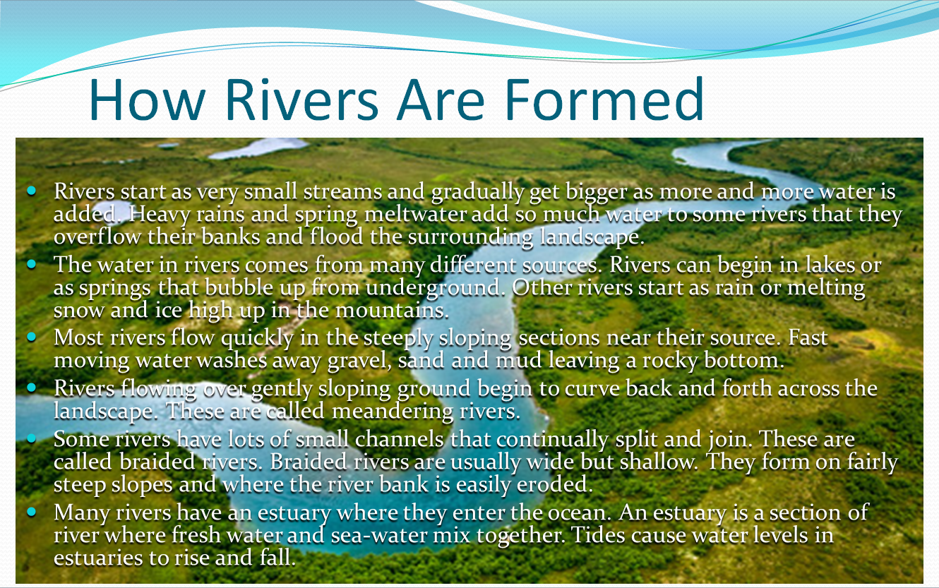
1 – Who thought an image in the background was a good idea?
Too much information
Images and text don’t mix. Period. We’ve achieved pretty much nothing at all by overlaying the text onto an image like this. You can’t see the image properly, and you can’t read the text easily either. The different colors in the background make it almost impossible to find a contrasting text color, and the many colors distract you from reading the words themselves.
This slide would look a whole lot better if there was one slide for the text, and another for the photo.
2 – Sooooo much to read
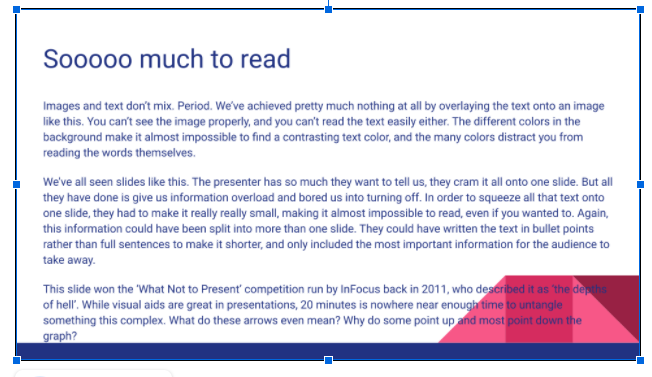
We’ve all seen slides like this. The presenter has so much they want to tell us, they cram it all onto one slide. But all they have done is give us information overload and bored us into turning off. In order to squeeze all that text onto one slide, they had to make it really really small, making it almost impossible to read, even if you really wanted to.
This slide could be improved by splitting up the information and putting it on more slides. Each point could be made in bullet points rather than full sentences to make it shorter, and they could also be rewritten to make sure they only include the most important information.
3 – Am I supposed to understand this?

Read about it: https://leejackson.org/worst-ppt-slide-contest-winners-infocus/
This slide is an oldie, but a goodie. It won the ‘What Not to Present’ competition run by InFocus back in 2011, who described it as ‘the depths of hell’. While visual aids are great in presentations, 20 minutes is nowhere near enough time to untangle something this complex. What do these arrows even mean? Why do some point up and most point down the graph?
I actually have no suggestions at all about how this slide could have ever avoided being called the worst presentation ever.
4. Boring fonts are boring
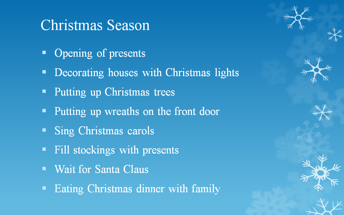
Yawn, please wake me up when it’s over
Christmas is supposed to be fun, the most magical time of the year even. So why is this slide absolutely no fun at all? Why use such a boring font? Where’s the pictures of Santa? Why is it cold and clinical rather than filled with the warm images and colors that we usually associate with Christmas?
The creator of this slide could have created a festive feeling simply by using a different color background (for example, red) which reminds people of Father Christmas, and compliments the text on the slide. A more exciting font would automatically make the audience want to read what is written. And some small images, some mistletoe maybe, would have given this slide a festive feel that this original totally lacks.
5 – My eyes hurt

Credit: https://24slides.com/presentbetter/bad-powerpoint-examples-you-should-avoid/
Ow, my eyes, my eyes. Why would anyone choose these color contrasts when creating a slide? This slide is a kaleidoscope of colors, which creates overload. The bright green background overwhelms the viewer, and the icons can’t stand out against it. The text colors were chosen to match the icons, but they also don’t stand out against the background.
Best practice for slides is to use high contrasting colors, for example black or dark blue font on a white, or very light colored background. Avoid dark backgrounds because they are not accessible to people with poor vision, or bright backgrounds because nothing stands out against them. You should also avoid color-blind combinations such as green and red, and blue and yellow.
6 – F for readability
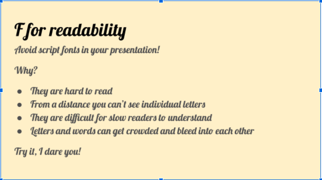
Script fonts may remind us of handwriting, and give your presentation a fun, informal feeling, but they are super difficult to read on a slide. From afar, the letters of a script font all run into each other, making individual letters, and even whole words unreadable! And when you have important stuff to say, you want to make it as easy as possible for everyone to read it.
When choosing a font for your presentation, you need to consider how readable it is. Script style or curly fonts are especially hard for people to read as the words bleed into each other. Serif fonts (like Times New Roman) have curly-ques attached to each letter, which can also make letters feel too close together.
Avoid making the worst presentation slides ever
Presentations are making a comeback in schools, colleges and offices. When the time comes for you to create your next presentation, use a template to make it look fun, slick, and professional, and avoid the trap of creating a slide that will be featured in a blog like this one day.
Check out Emaze’s templates, and choose the one that suits your topic and style. They are easy to use, and will make your finished presentation look great.
Have you seen a really bad presentation? Tell us about it at info@emaze.com