


You may have heard rumors that PowerPoint is the enemy. I’m here to confirm that the speculations are in fact true, PowerPoint is the root of all evil.
But this isn’t a means to an end, presentations are a necessary component to story narration. Presentations serve as talking points or visual aids to address your audience. Imagine a world with hour long TED lectures without visual components, no audio enhancements or tantalizing infographics.
There is a solution and I’ll give you a hint, it’s not PowerPoint, it blows even the best PowerPoint presentations out of the park. So what is the best PowerPoint presentation alternative to help achieve presentation greatness? You’ll have to read more to find out.
Best PowerPoint Presentation to Bore an Audience
It was the summer of 2009 in Kabul, Gen. Stanley McChrystal was presented with a PowerPoint slide of American and NATO forces in Afghanistan that made a laughing stock of the US military. The train wreck featured in the image below, was created to display the complexity of the American military strategy. This horrific image quickly went viral.
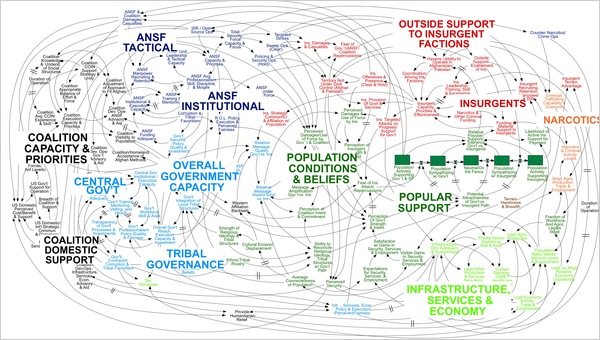
This slide, part of a presentation by senior ranking US military officials, is just one of many unintelligible flowcharts produced. A great PowerPoint presentation shouldn’t bore your audience, it should engage them. Especially when the political relations are already boring enough on their own.
The Least Professional PowerPoint Presentations
When the online site Company Command asked a senior ranking official in Iraq how he spent his working hours, he replied by detailing his spent time on creating PowerPoint slides into the wee hours. While Defense Secretary Robert Gates spent his time reviewing print-out PowerPoint slides as part of his wasted morning ritual.
If you ask me, this doesn’t sound like resourceful time well spent with our tax dollars – glazing at poorly designed slides, complex and illogical graphs and boring charts all make the recipe for the least professional PowerPoint presentations. Learn what it takes to make an amazing PowerPoint presentation.
What Makes a Good PowerPoint Presentation
The recipe to what makes a great presentation has two components: The presentation itself and, the story you tell behind it. The most common mistakes we often make are using excess bullets and filler text. Text is meant to be used as a talking point, not as a visual aid. Graphics are there to narrate your story and bring the oral presentation to life. Learn more about what makes a good presentation and how to improve your presentation skills here.
Example of a good presentation: